You only notice a roof shingle color when it feels wrong.
Maybe it turns your warm brick home cold and gray. Maybe it fights your siding. Or maybe it looked perfect on a tiny sample – then reads much lighter across 3,000 square feet in full sun. Because a roof is one of the biggest visual surfaces on your home, the color decision has outsized consequences: curb appeal, neighborhood fit, and even how confident you feel pulling into the driveway.
This is a practical guide for homeowners who want to get the color right the first time. Not by guessing, but by using a few dependable checks that take the “I hope this works” out of the decision.
Start with what cannot change (or won’t soon)
The fastest way to narrow choices is to treat your roof like it belongs to a system – because it does. Your roof color has to cooperate with permanent or semi-permanent elements you probably are not replacing in the same project.
Look at your fixed finishes first: brick, stone, stucco, large concrete elements, and any prominent chimneys. These materials have built-in undertones (warm, cool, neutral) that do not negotiate. A roof shingle color that shares the same undertone will look intentional. A roof that clashes will look like a patch, even if you picked a “popular” shingle.
Then look at the big, replaceable surfaces: siding, trim, and shutters. If you are doing a full exterior refresh, you have more flexibility. If you are only replacing the roof, let the existing siding and trim lead the conversation.
As a rule, your roof should either (1) quietly support the rest of the palette or (2) anchor it. Most homes look best when the roof is the anchor, not the attention-grabber.
How to choose roof shingle color based on home style
Architecture does not require strict rules, but it does reward consistency. The easiest way to make a roof feel “right” is to choose within the vocabulary of your home’s style.
A traditional Colonial, Cape Cod, or farmhouse tends to look sharp with classic neutrals – charcoal, weathered wood tones, deep browns, and true blacks – because the roof line is often simple and symmetrical. These colors underline the structure.
Ranch and mid-century homes often benefit from slightly warmer, earth-forward blends (think driftwood, taupe-grays, and browns) because the long roof planes can dominate the view. A blended shingle that adds visual texture can keep the roof from looking like a flat sheet.
Contemporary homes can carry darker, cleaner choices that match modern windows and trim. The risk is over-committing to a trend. If you plan to sell within a few years, keep “modern” grounded in neutral.
If you are unsure what style category your house fits, step back and look at the roof shape and window rhythm. If the home reads classic, stay classic. If it reads modern, you can push darker – but keep the rest of the exterior calm.
Use undertones, not color names
“Gray” can mean cool steel, warm greige, or blue-based slate. “Brown” can read red, gold, or neutral depending on sunlight and the granule blend. Color names on sample boards are marketing, not chemistry.
Instead of hunting for the perfect named shade, look for undertones:
Warm undertones pair well with tan, cream, warm white, red brick, and many stones.
Cool undertones pair well with crisp whites, blue-gray siding, and modern black window frames.
Neutral undertones are the safe middle when you have mixed materials or you are planning future updates.
A quick test: hold the shingle sample next to your siding in indirect daylight. If one makes the other look “dirty” or oddly tinted, the undertones are fighting.
Sunlight changes everything – test where the roof actually lives
A roof color on a sample in your hand is not a roof color on your home. Scale and lighting change it.
Bright sun often makes shingles read lighter and more contrasty. Shade can deepen the same shingle into something moodier. If your home has large trees, north-facing slopes, or deep porch overhangs, you will see multiple versions of the same color from different angles.
This is why physical test placement matters. If you can, place multiple samples outside at different times of day. Morning, mid-day, and late afternoon will tell you what the shingle really wants to be.
If you are deciding between two close colors, the one that looks slightly too dark on the sample often ends up looking just right once installed across the full roof plane.
Climate and performance: what color does (and doesn’t) affect
Homeowners often ask whether roof color changes energy bills. The honest answer is: it depends, and it is usually smaller than people expect.
Darker roofs can absorb more heat, which can raise attic temperatures. Lighter roofs reflect more. But insulation levels, ventilation, air sealing, and attic design often matter more than shingle color alone. In many climates, the practical difference is modest compared to getting the roof system built correctly.
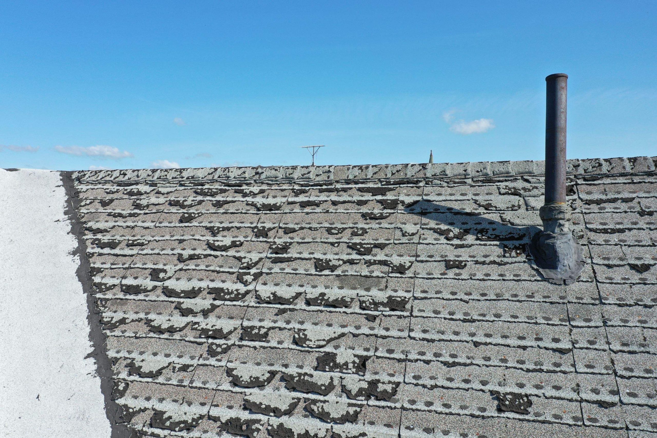
Here is the trade-off worth considering: lighter shingles can show algae staining and general grime sooner in humid regions, while very dark shingles can show high-contrast debris like pollen or dust in certain seasons. Either way, choosing quality shingles and proper ventilation is the bigger “long-term performance” lever.
If storm readiness is part of your goal, focus on impact ratings, installation quality, and flashing details before you let color drive the whole decision.
Neighborhood fit and resale: play it smart without going bland
If you plan to sell in the next 3-7 years, you do not need the most exciting roof on the street. You need the roof that makes your house look cared for, updated, and easy to say yes to.
In most markets, the safest resale choices are neutral blends: charcoal/black, weathered gray, and medium browns. They pair with a wide range of siding colors and keep the home looking cohesive even if a future owner changes trim or paint.
That does not mean you have to be boring. A blended shingle can add depth without locking you into a narrow palette. Think of it as texture, not a statement color.
Also consider the neighborhood rhythm. If every home around you has warm browns and you install a blue-toned gray roof, your home may feel disconnected. Standing out can be good, but “doesn’t match anything” is rarely the kind of standout that adds value.
Match to your exterior palette (the 60-30-10 idea)
Most exteriors fall into a simple balance: a dominant color (often siding), a secondary color (trim), and an accent (front door, shutters, stone highlights). Your roof is not a small accent – it is a major field.
If your siding is high-contrast or bold (deep blue, green, black), your roof usually needs to calm things down with a neutral anchor. If your siding is neutral (white, beige, light gray), you can choose a roof with a bit more depth and variation.
When homeowners end up unhappy, it is often because the roof competes with the siding for attention. The best-looking homes feel organized from a distance.
Don’t forget the “small” elements that become obvious later
A roof color decision should include the pieces that sit on top of it. Black roof vents on a light roof can look like polka dots. Some shingle colors make white pipe boots and flashing stand out more than you expect.
You also want to think about gutters and fascia. If you are replacing gutters, this is an opportunity to coordinate finishes so the roof edge looks clean and intentional.
If you have copper accents, a warm shingle usually makes them look richer. If you have lots of black window trim, a charcoal or black roof can make the whole exterior feel more premium and unified.
The fastest way to feel confident: visualize it on your actual home
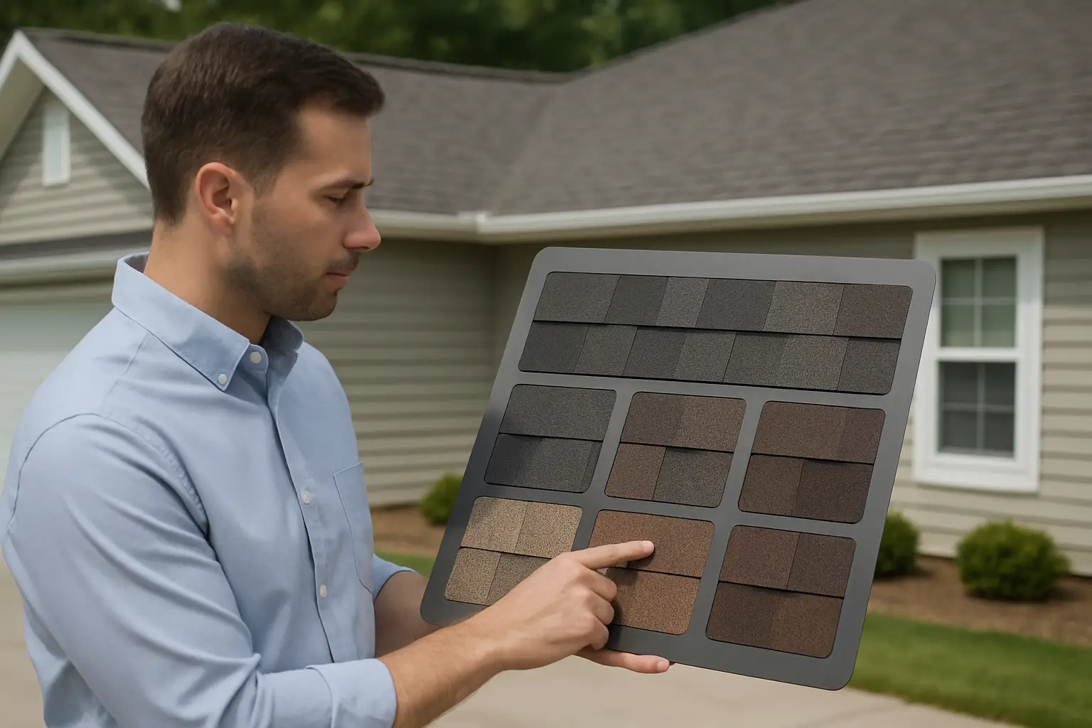
Even with samples, it is hard to imagine a roof color at full scale. That is why visualization tools can be a game-changer. Seeing shingles mapped onto your home photo helps you catch issues early – like undertones clashing with brick, or a color reading much lighter than expected.
If you want a more guided process, A Plus Exterior LLC offers an AI-powered roof visualization and a design-your-dream-roof experience at https://www.trustinaplus.com so homeowners can compare options with less guesswork and more clarity.
A simple decision process that prevents regret
If you are feeling stuck between several colors, reduce the decision to a few controlled steps.
First, narrow to 3 shingle colors that match the undertone of your fixed materials. Second, view those samples outdoors next to your siding and trim. Third, eliminate any color that feels “loud” from across the street – roofs should read calm at distance. Finally, choose the option that still looks good in shade and sun, not just one lighting condition.
If you are between a solid color and a blend, blends are usually more forgiving. They hide minor staining, soften transitions between materials, and add depth that looks higher-end without shouting.
And if you keep circling back to one choice because it makes your whole exterior look more expensive and more cohesive, that is usually your answer.
Close the loop with one last real-world check: stand in the driveway, then walk across the street. The right shingle color will make the home look put-together and protected – the way a roof should feel before you ever think about style.
Need Help Choosing Your Roof Color?
Explore options with Design My Home, get a fast estimate with Instant Roof Quote,
or reach out for a consultation.