You can stand in your driveway and squint at shingle samples all day and still feel unsure. The problem is not your taste – it’s scale, lighting, and context. A 4-inch sample can look “perfect” in your hand and completely wrong once it’s covering 2,500 square feet under bright sun or a gray winter sky.
That’s why a roof color visualizer for my house has become one of the most useful decision tools in exterior remodeling. It turns a stressful, high-stakes choice into something you can actually evaluate: what the roof will look like on your home, with your siding, in your neighborhood, before any nails go in.
What a roof color visualizer actually does (and what it can’t)
A roof visualizer is a digital tool that lets you preview different roofing colors and styles on a photo of your home, or on a similar home model. The best versions let you toggle shingle colors, compare blends, and see how the roof interacts with siding, trim, stone, and even gutters.
What it does well is solve the “context” problem. Roof color is not just a roof decision – it’s a whole exterior decision. The visualizer helps you catch common pitfalls early, like choosing a shingle blend that fights with your brick undertones or makes your siding look dingy.
What it cannot do is guarantee exact color accuracy. Your screen calibration, the time of day your photo was taken, shadows from trees, and even your phone camera’s processing can shift tones. Use it to narrow confidently to a short list, then confirm with real samples outside, on multiple sides of the house.
Why roof color feels harder than it should
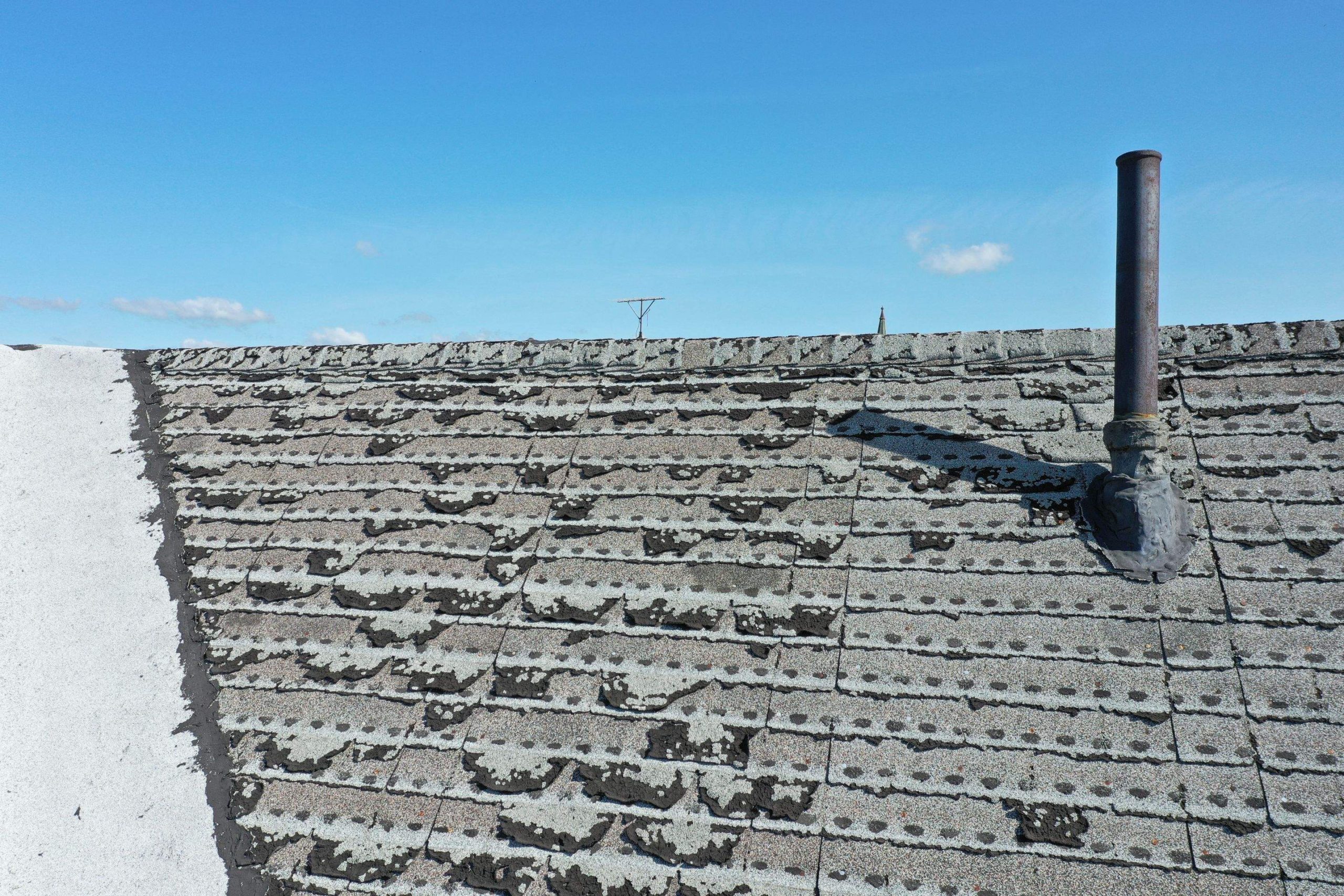
Most homeowners expect to choose between “black,” “brown,” or “gray.” In reality, modern shingles are often blends: charcoal with subtle blues, weathered wood with warm and cool flecks, driftwood grays with taupe notes. Those undertones matter because they either harmonize with your fixed materials (brick, stone, concrete) or they don’t.
Lighting makes it trickier. A roof that looks deep charcoal at noon can read nearly black at dusk. A warm brown can wash out and look flat in bright sun. And if your home has a lot of shade from mature trees, a roof with strong contrast can look heavier than you intended.
A visualizer doesn’t remove judgment, but it gives you a safer way to test the decision you’re about to live with for 20 to 40 years.
How to use a roof color visualizer for my house the right way
The biggest difference between a helpful preview and a misleading one is the starting photo. If the tool allows you to upload your own image, take a photo straight-on (not angled up from the driveway), ideally on a bright but slightly overcast day so the shadows don’t distort the roofline. Make sure the full roof planes are visible, and avoid extreme wide-angle shots.
Once you’re in the tool, don’t start by chasing trends. Start by honoring what you can’t change easily. If you have red brick, you’re dealing with warm undertones. If you have cool gray stone, that’s a different direction. If your siding has a creamy, warmer white, a super-cool roof can make the house feel mismatched.
From there, test roof colors in families.
Step 1: Set your “fixed” exterior elements first
If the visualizer lets you modify siding and trim too, resist the temptation unless you’re actually changing those. Keep your current exterior as accurate as possible. The goal is to avoid picking a roof color that only looks good after you imagine three other projects.
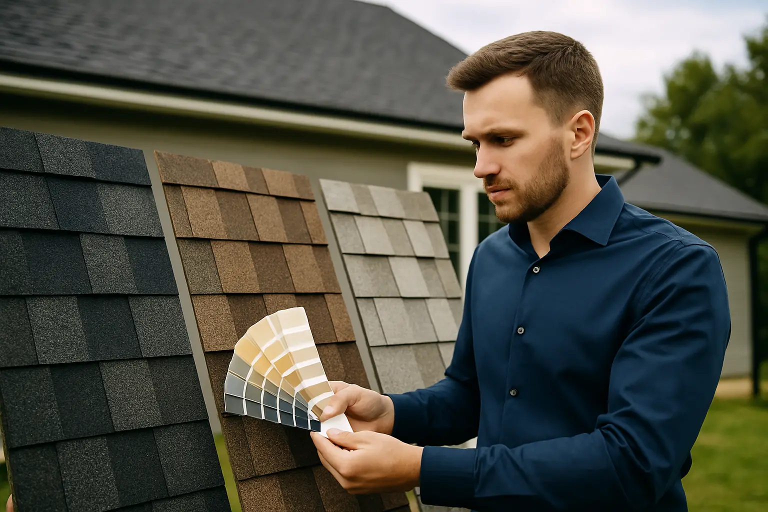
Step 2: Compare three options, not fifteen
When homeowners scroll through every color, it becomes harder to decide. Narrow to a practical set: one safe option, one slightly bolder option, and one that’s closest to your original instinct. Then evaluate those three in a calm, repeatable way.
A simple method is to view each option and ask two questions: Does it make the house look cleaner and more intentional? Does it make any part of the exterior look “off” – too pink, too yellow, too green, too flat?
Step 3: Look at the roof as a shape, not just a color
A high-contrast roof can visually lower the house and make the roofline feel dominant. A mid-tone blend can soften the roof plane and let your landscaping and entry details lead. This is where a visualizer shines: you see the roof’s visual weight on your specific home.
Step 4: Test in the conditions you actually live in
If you get snow cover for part of the year, darker roofs can look crisp and defined against white surroundings, while lighter grays can blend in more. If you’re in a hot, high-sun area, consider how bright light can make some colors appear washed out.
Also consider your tree coverage. Heavy shade can make dark shingles read almost black. If you want definition but not heaviness, a textured “weathered” blend can be a smart compromise.
Matching roof color to siding, brick, and stone
There’s no one “best” roof color, but there are combinations that tend to perform well because they respect undertones.
With red or orange-toned brick, many homeowners land on a warm charcoal, a brown-gray blend, or a deeper brown that echoes the brick without matching it. Going too cool can make the brick look more orange. Going too red-brown can feel dated, depending on the brick.
With gray brick or cool stone, a true charcoal, black, or a cool gray blend usually looks clean and tailored. Warm browns can still work, but the risk is that the exterior starts to look like it can’t decide if it’s warm or cool.
With tan or beige siding, you have flexibility. A dark charcoal can modernize quickly, while a medium “weathered wood” blend can feel traditional and forgiving. The visualizer helps you see whether tan plus dark roof reads upscale – or just high contrast.
With white siding, almost everything can work, which is why the decision can feel paralyzing. In that case, look at your accents: shutters, stone, porch columns, or your front door color. The roof should support the overall style you want, whether that’s classic, modern farmhouse, or contemporary.
The trade-offs homeowners don’t hear enough about
Color isn’t only aesthetic. It can affect maintenance perception, resale appeal, and how “busy” the roof looks.
Darker roofs can feel premium and crisp, and they tend to coordinate well with modern palettes. They can also show harsh lines from debris more clearly if you have overhanging trees.
Lighter roofs can look softer and sometimes hide minor debris better, but very light grays can look flat on certain homes, especially if the siding is also light and there’s little contrast in trim.
Multi-tone blends are often the safest choice for real homes because they disguise dimension changes, reduce the appearance of minor scuffs, and bridge warm-cool exterior elements. The downside is that some blends can look “speckled” if the mix is aggressive. A visualizer is the fastest way to catch that before install day.
When a visualizer is most valuable (and when it’s not enough)
A roof color visualizer is most valuable when you’re dealing with permanent materials you can’t easily change, like brick, stone, or a large porch or chimney structure. It’s also a lifesaver when you’re trying to modernize a home without making it look stark.
It’s not enough when your home has unusual lighting conditions or heavy shade that makes screens lie. It’s also not enough if you’re selecting between very close shades that only differ in undertone. That’s when you move from digital to physical samples, viewed outdoors, morning and afternoon, on at least two sides of the home.
If you want the decision to feel truly confident, use both: visualizer to choose finalists, samples to confirm.
Getting from “I like it” to “I’m sure”
The most confident roof color choices come from a process, not a gut reaction.
Use the visualizer to create two or three strong contenders. Then look at your home the way buyers see it: from the street, at an angle, with the landscaping and driveway in view. Ask yourself if the roof color makes the house feel updated, balanced, and intentional.
Finally, connect the color to performance and scope. If your roof project includes ventilation upgrades, rot repair allowances, flashing details, and clean workmanship, you’re not just buying a color – you’re buying protection that looks great doing its job.
At A Plus Exterior LLC, we built our customer-led design experience around this exact problem: homeowners want to see the outcome before they commit, and they want the install to be clean, well-managed, and clearly scoped. If you’re ready to explore colors and materials with a guided process, you can start with our interactive design tools at https://www.trustinaplus.com.
Choosing a roof color should feel like relief, not roulette – when you can see your options on your actual home, the right answer tends to become obvious.